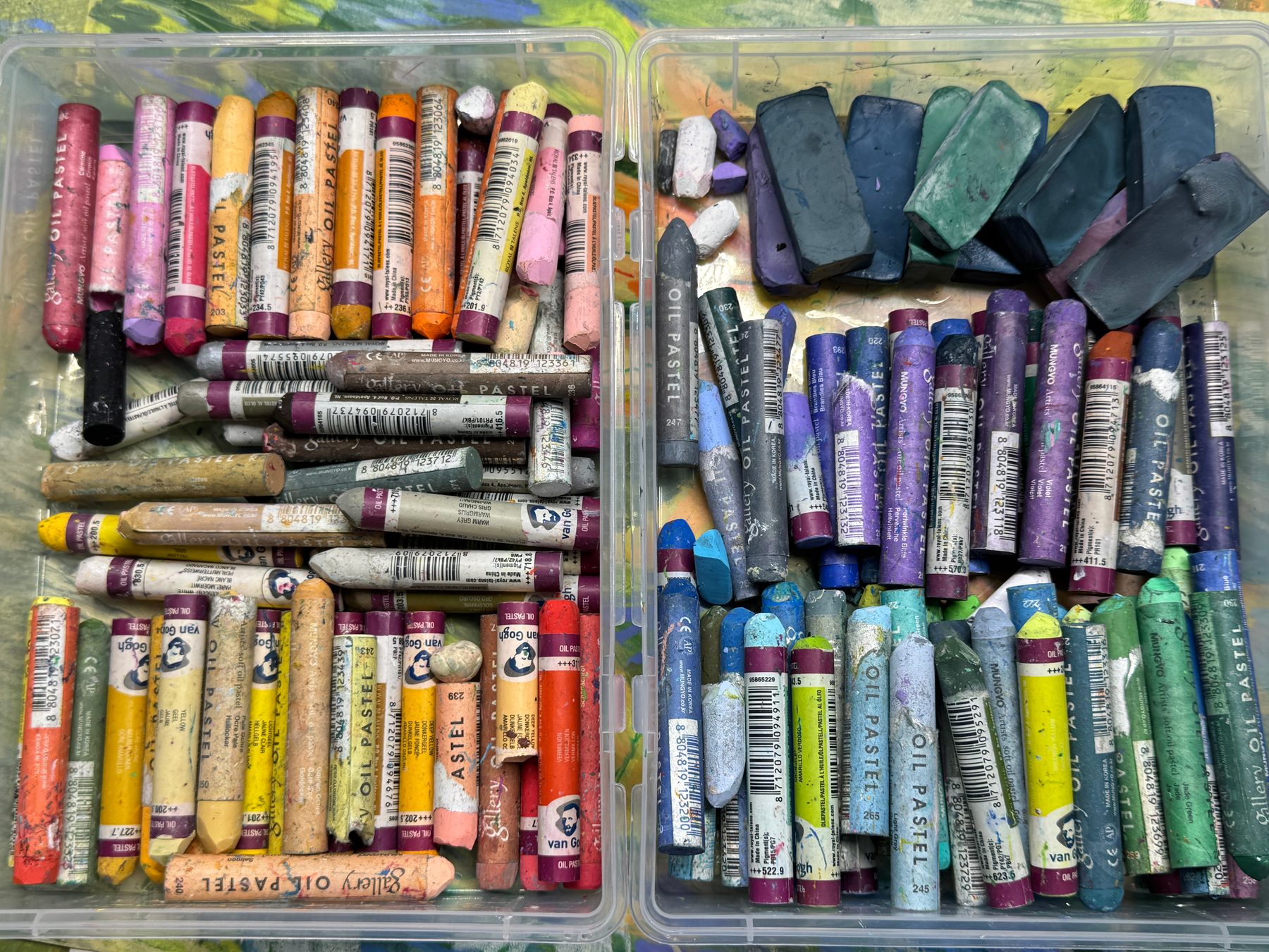
I see myself more as someone who draws than someone who paints. I like painting very much, but I keep leaning towards drawing. The stroke matters to me. The rhythm of the strokes matters too. That is probably the main reason I love oil pastels.
Oil pastel gives me rich colour straight away, which coloured pencils can’t do. It also covers a sheet much faster.
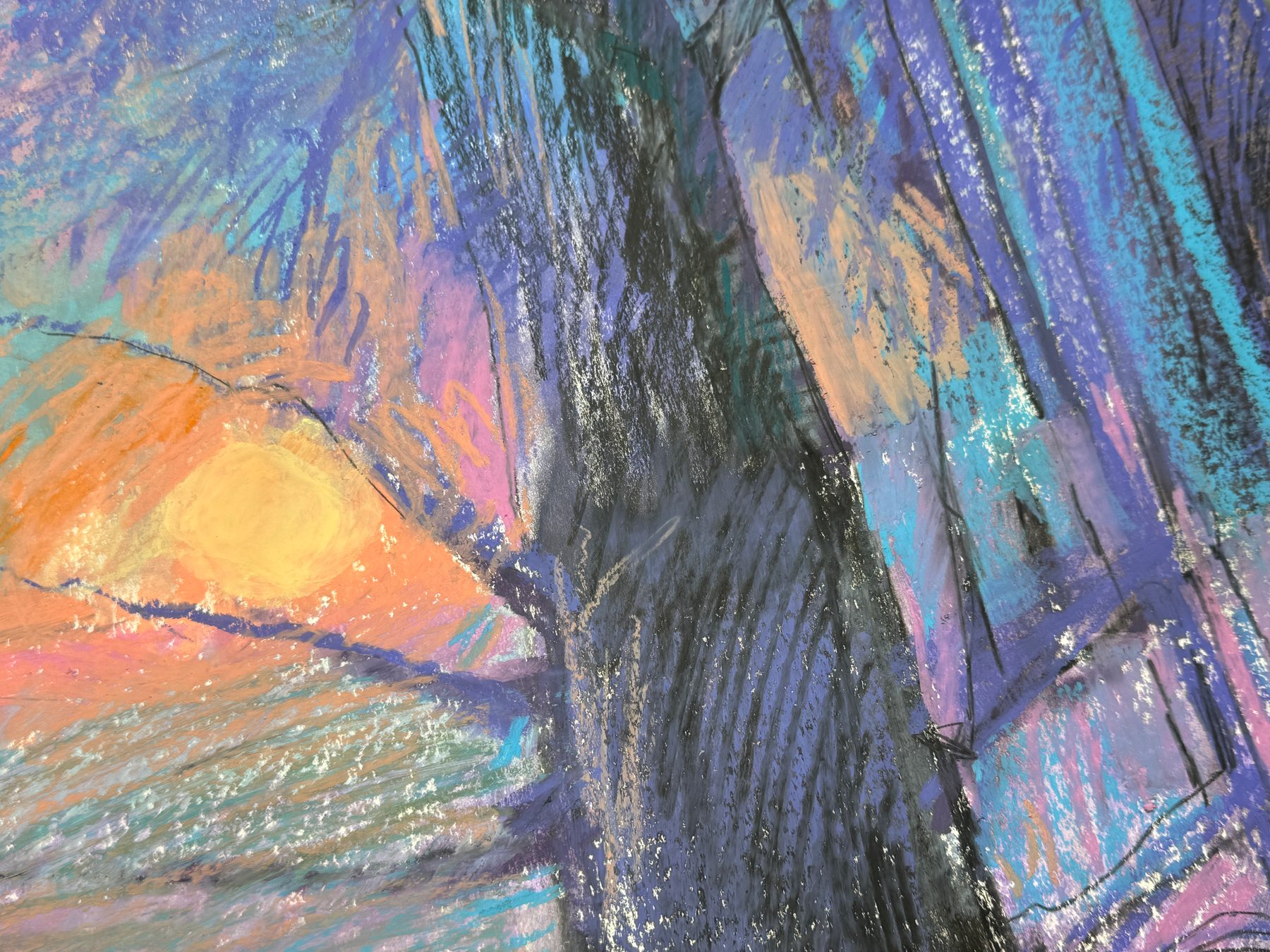
Some artists draw from the wrist: the hand rests on the table, and only the wrist moves. That is comfortable for small details. I prefer to draw with the whole arm, with the elbow moving back and forth, or even the whole arm from the shoulder. That gives wide, energetic strokes, and they need room. For drawing from the wrist, A3 is a big sheet. For drawing with the whole arm, it is a small one. So I usually take A3 or larger. I have also heard people say that it is worth drawing with the whole arm even on a sheet like A3, so as not to get stuck in small details. For me it is mostly about pleasure.
Covering an A3 sheet with coloured pencils takes a lot of effort and a very long time. With oil pastels it is much easier.
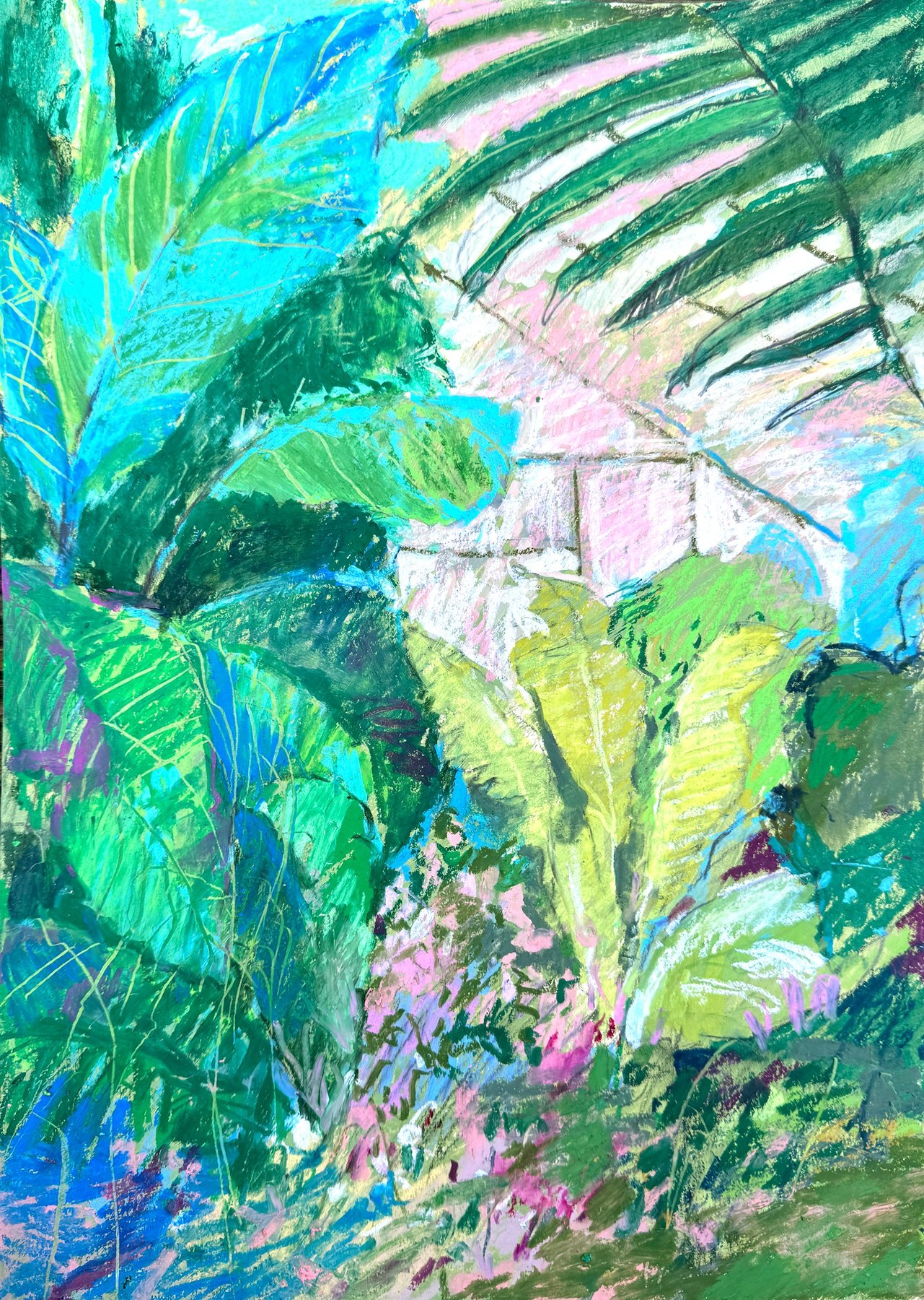
Oil pastel, acrylic markers and pencils, A3
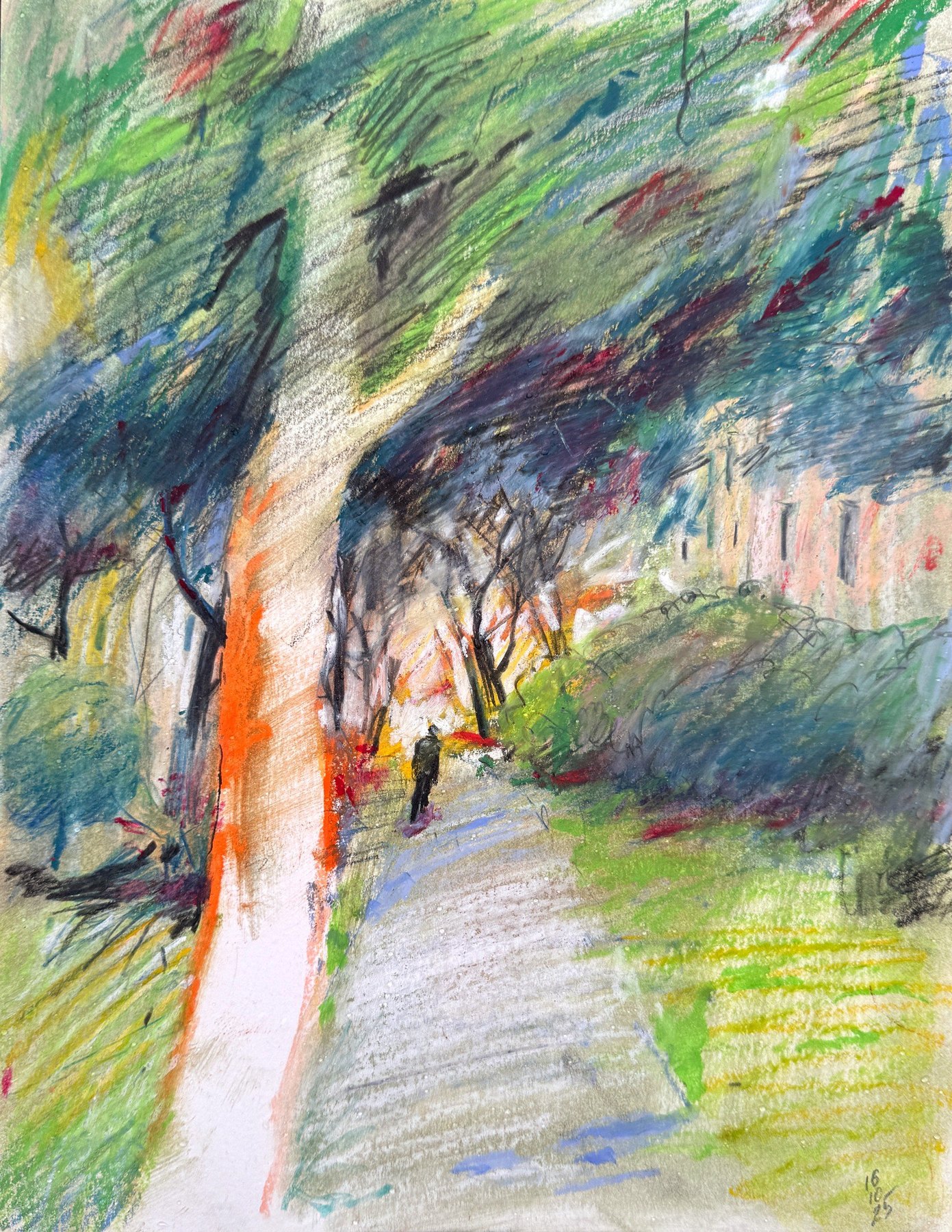
Oil pastel on paper, 30.5 × 23 cm
This is how I use them. These are not rules, just my own habits. Most of them are about the stroke in one way or another.
Hard, medium and very soft
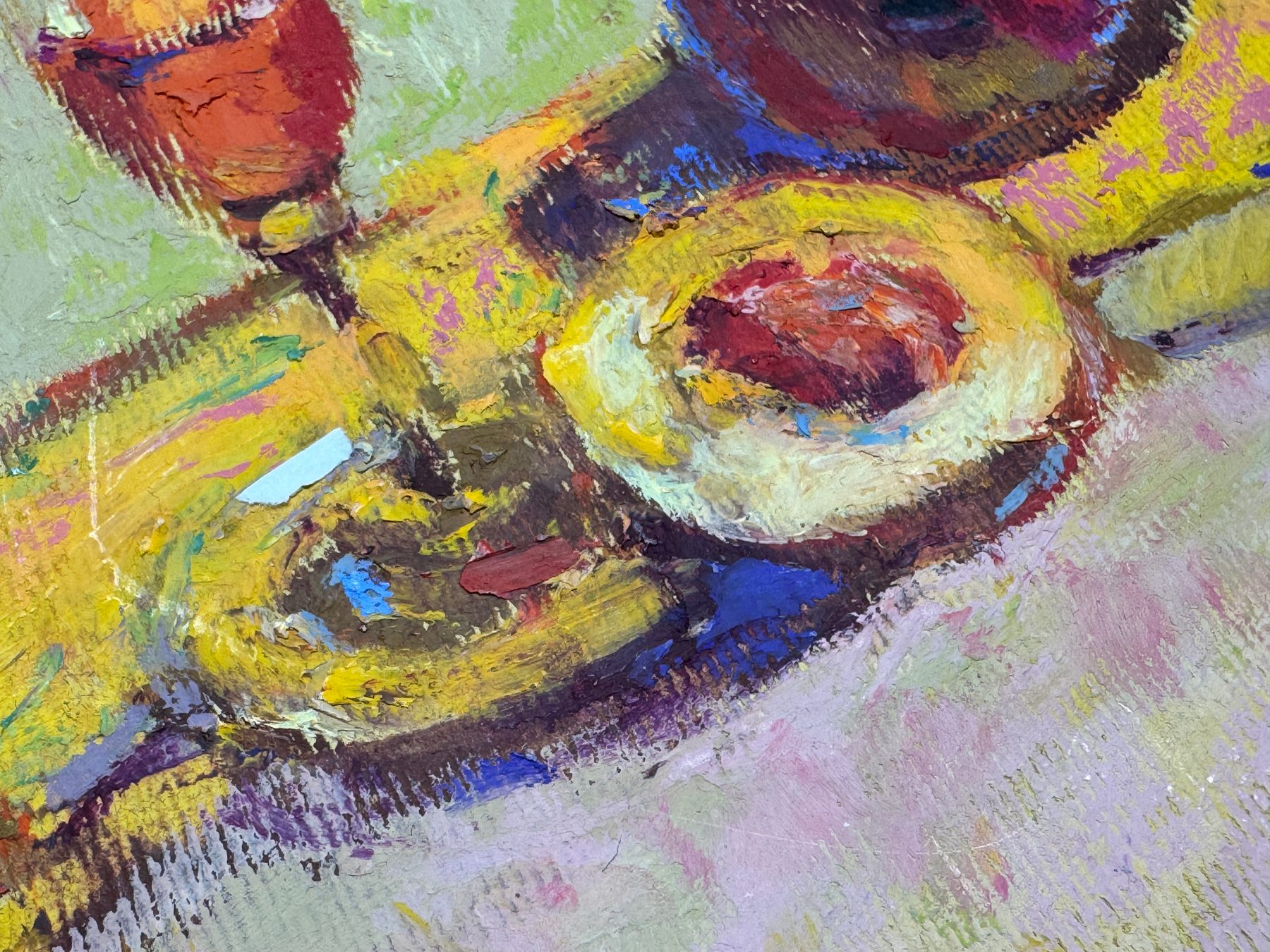
Oil pastels can be hard, medium or very soft. I like them closer to hard. A harder pastel gives me a feeling of precision when I draw. It also smudges less.
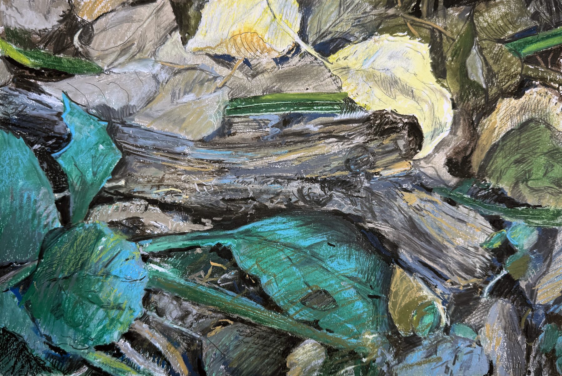
Hard pastels are usually cheaper than soft ones. But soft pastels cover the layers underneath much better. Some cheap brands hardly cover at all: the colour underneath just shows through.
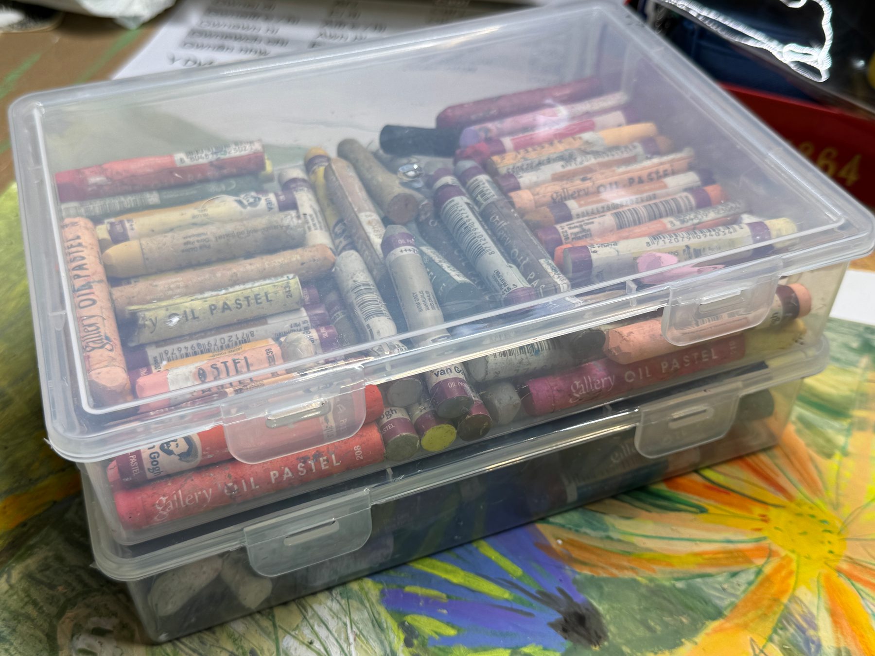
How I keep them
I keep my oil pastels by colour, in three groups: pinks and yellows, blues and greens, and greys and browns.
The violets go in with the blues and greens. Sets of oil pastels usually come with a lot of violets, and I rarely use them.
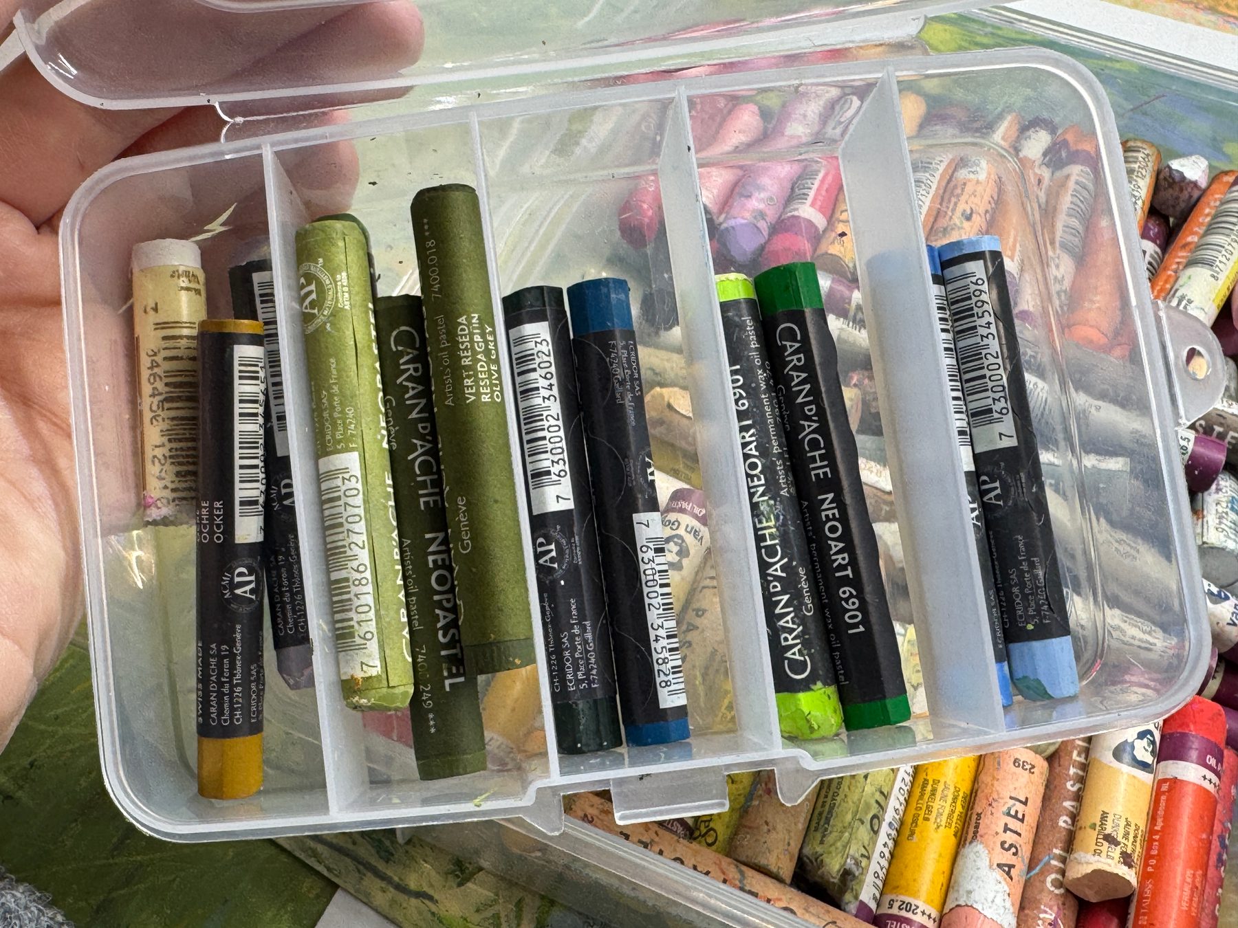
The colours I use most
It is the same story as with any paint, and with coloured pencils too. The colours I use most are greens: light ones, dark ones, olive ones. Then a rusty brownish orange, and ochre. I also use a lot of light sky blue, white, and all the shades of beige.
Colours mixed with grey are usually useful as well: grey-green, grey-blue.
I even melted down the bright colours I don’t use and added black or grey to them. That gave me muted greens and blues, and now I use them a lot. I show this in my winter video.
Although there is another way to get these colours: optical mixing. Strokes of pure colour go on top of each other. Up close they are separate strokes. But the viewer’s eye mixes them, especially from a distance, and sees the colour that was needed.
Many people prefer physical mixing instead. They usually take softer pastels and blend them with a special stick with a soft tip, like a double-ended pastel blender, rubbing until the colours really mix on the paper. Paper stumps work for this too, and even ordinary cotton buds.
Coloured gesso instead of special paper
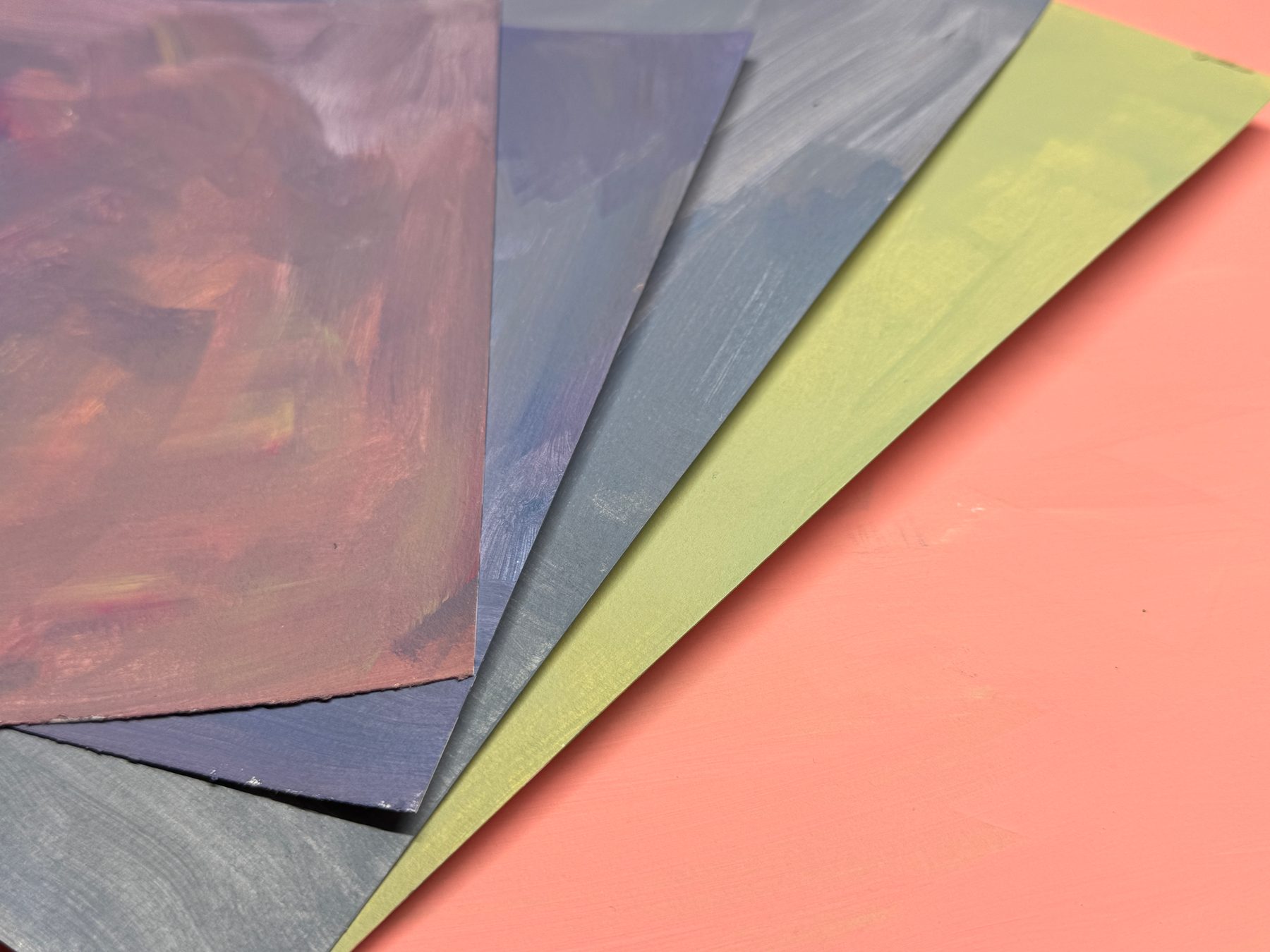
This is what I use for oil pastels myself, and what I would recommend. I take gesso and add acrylic paint to it, so the gesso becomes the colour I need. Then I cover the paper with it.
It protects the paper. The oil from the pastels doesn’t soak in and make the paper oily. This matters most with soft pastels: I think they have more oil in them.
It also gives the surface tooth, so the pastel grips it. It is very comfortable and pleasant to work on, with hard pastels too.
So I don’t need expensive or special paper for oil pastels. Ordinary paper with a coat of gesso is enough.
And then there is the colour. On a coloured ground there are no white gaps between the strokes, like the ones you get on white paper. Some people like those gaps. Some artists leave white gaps and unpainted areas on purpose.
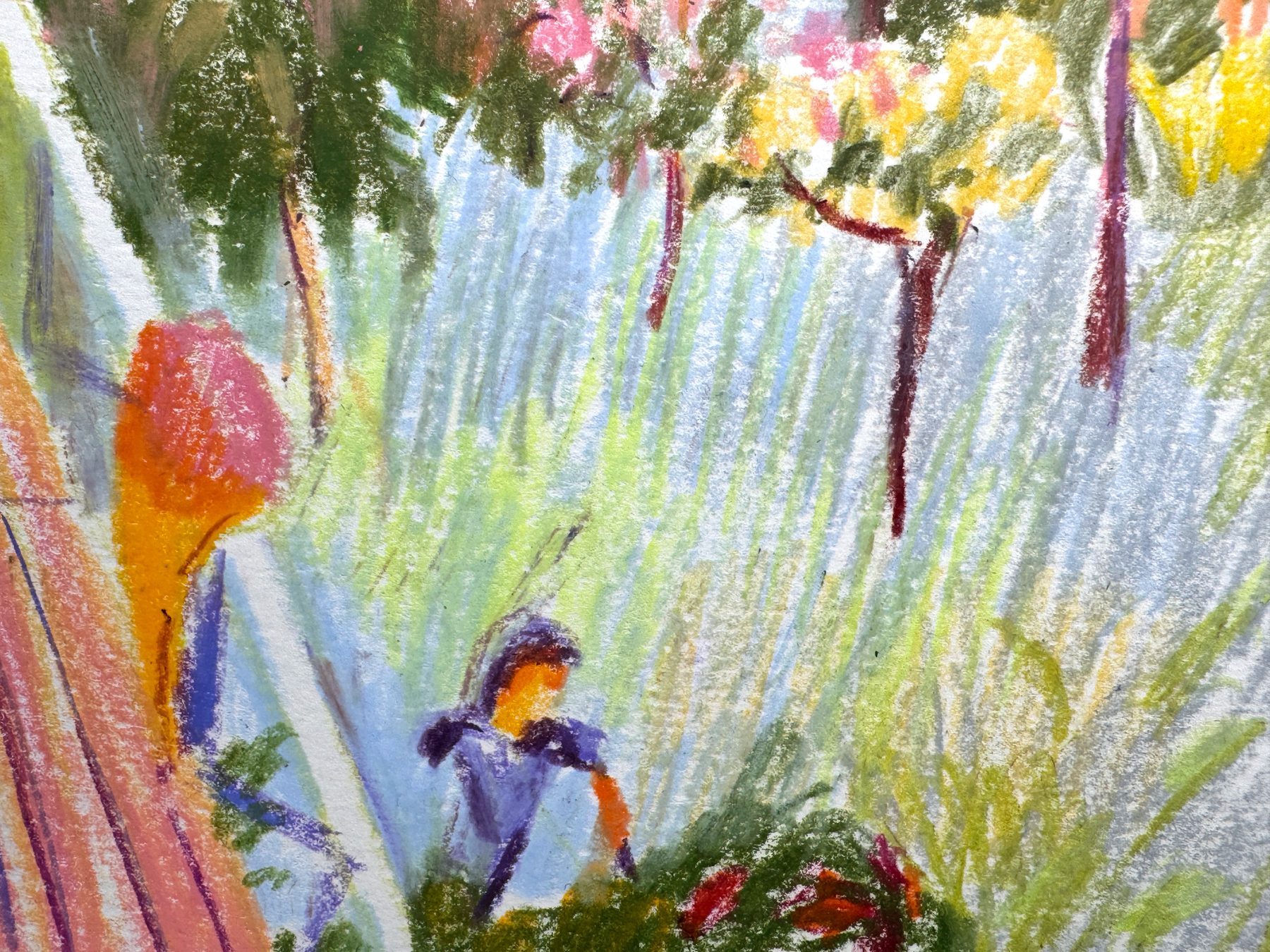
But when starting is hard and a white sheet feels scary, a coloured ground can help a little. And without the white gaps the work looks finished at any stage, wherever I decide to stop.
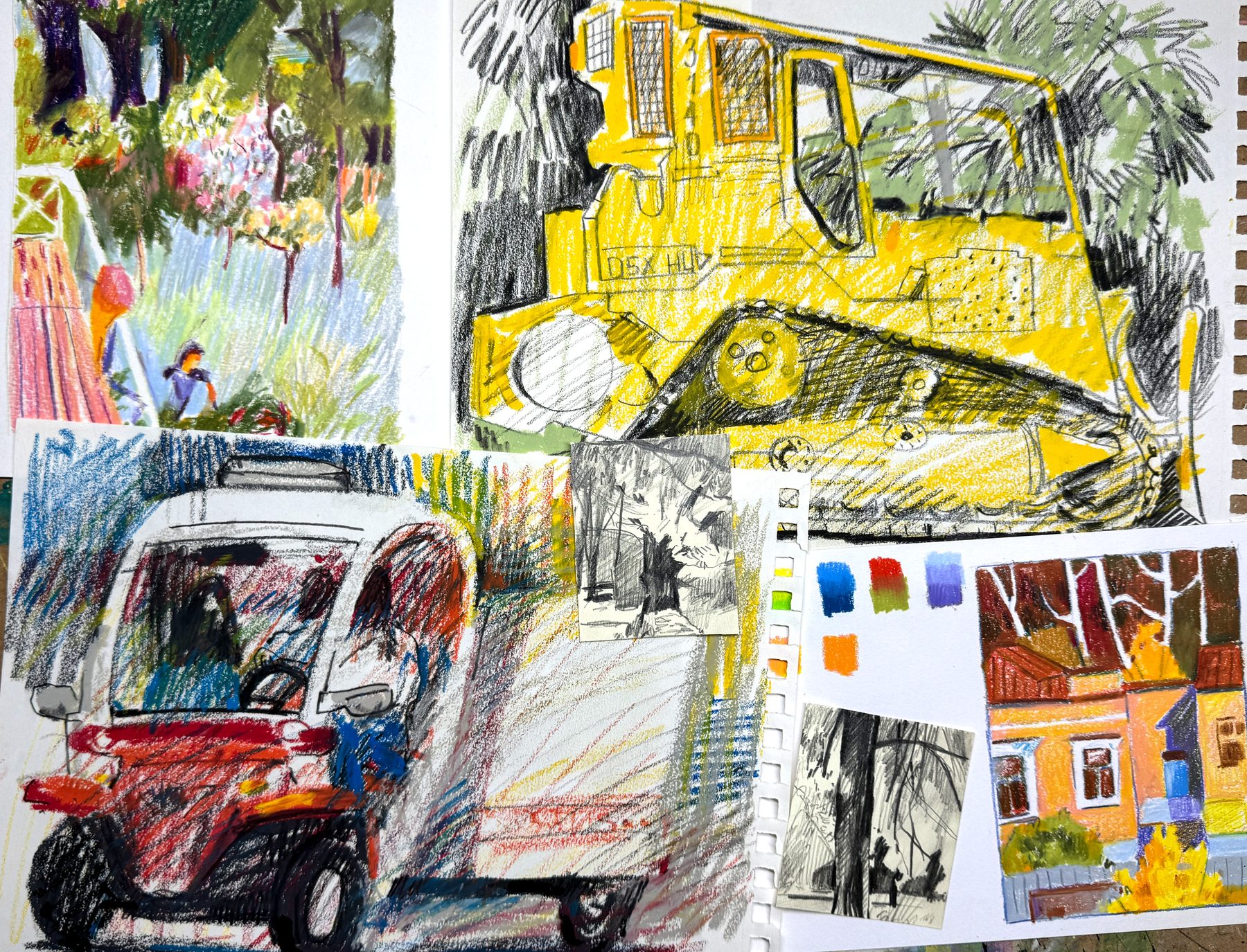
A black pencil
Another thing that works well with oil pastels is a soft black pencil or a graphite stick. I really love the Cretacolor Nero soft lead, 5.6 mm. I use it on its own for drawing, and together with oil pastel.
Underneath, and rubbing
There can also be a layer of acrylic or gouache under the pastel.
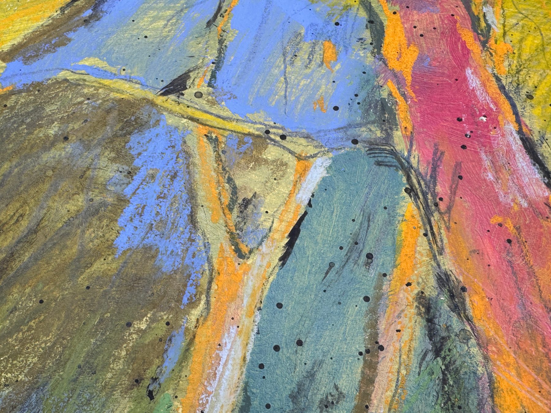
And two finished works with a layer of paint underneath:
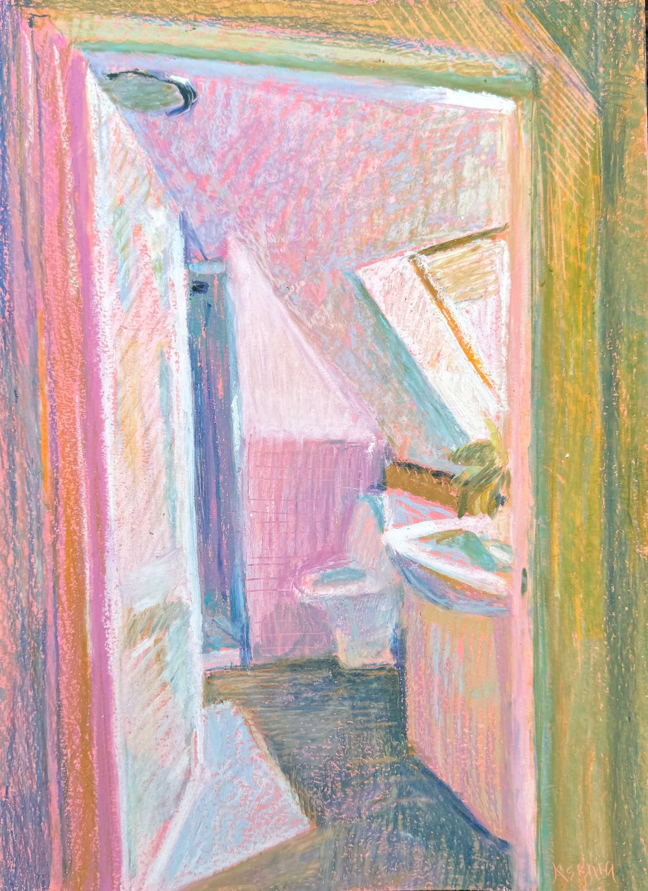
Acrylic and oil pastel, 29.7 × 21 cm
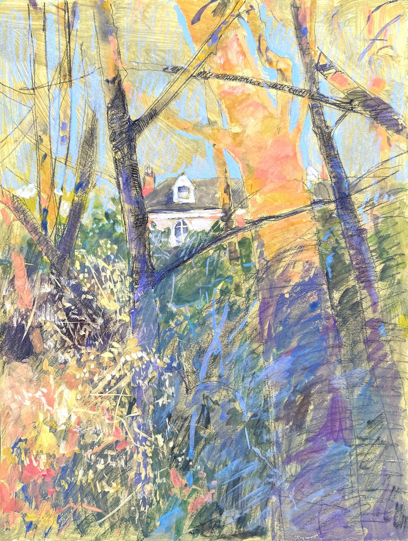
Gouache, graphite and oil pastel, 56 × 42 cm
If the paper wasn’t primed and stayed white, I sometimes put down a few strokes of oil pastel and rub them with a cloth. A dry cloth works, but it is harder to rub. Or I take a drop of solvent, just one drop, and rub with that. Then the white gaps on the sheet disappear. I show this quickly in my video about short trips around Wales, along with a few oil pastel works.
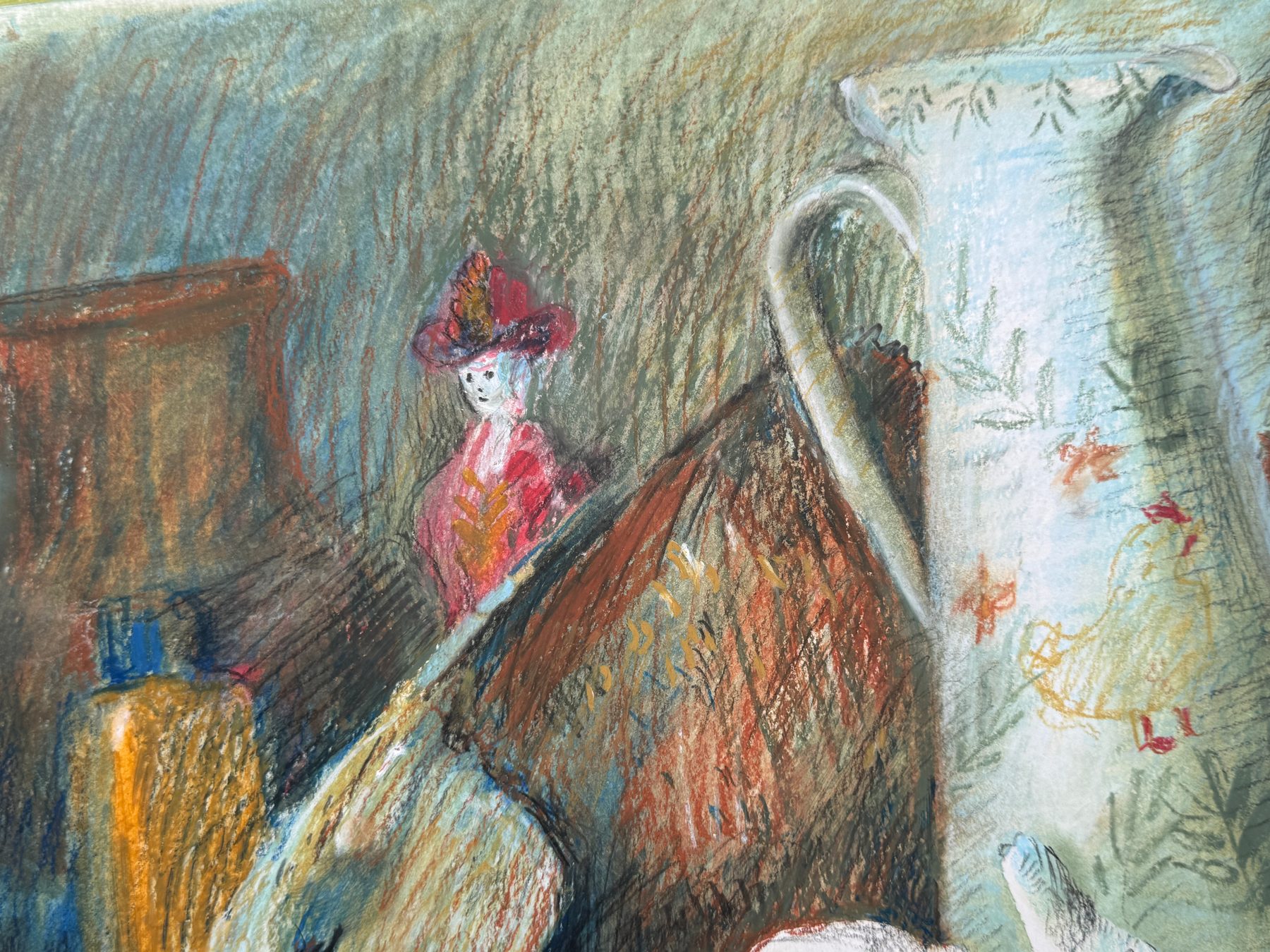
But I like to rub so that the strokes still show. I try to rub them in, and the strokes stay visible anyway. I don’t rub them away completely.
Scratching
When I need thin lines, I often scratch into the oil pastel with a palette knife. Grass, for example.
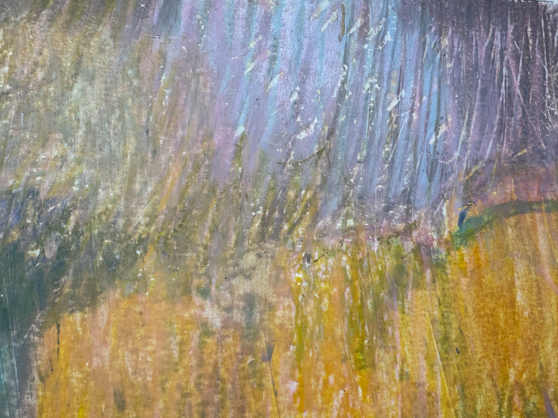
In these two, oil pastel sits together with soft pastel, acrylic and oil paint.
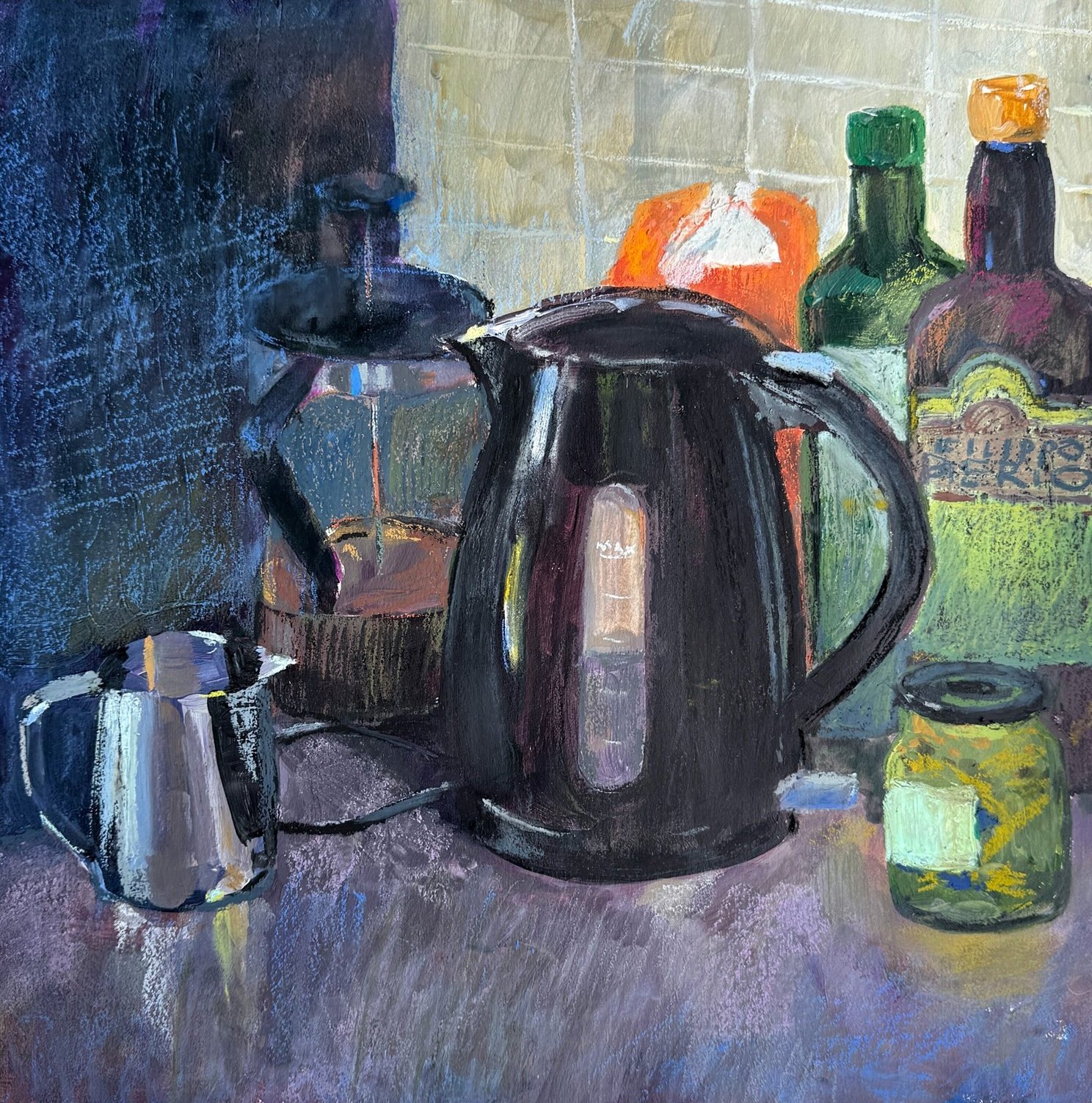
Acrylic, soft pastel and oil pastel, 40 × 40 cm
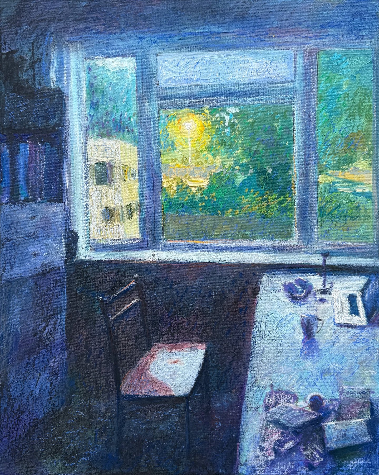
Oil paint, oil pastel and soft pastel, 40.6 × 50.8 cm
More of my work is on the Works page. And in this video I take one oil pastel drawing from start to finish.